Sapor Craft Preserves

Design Process and Branding
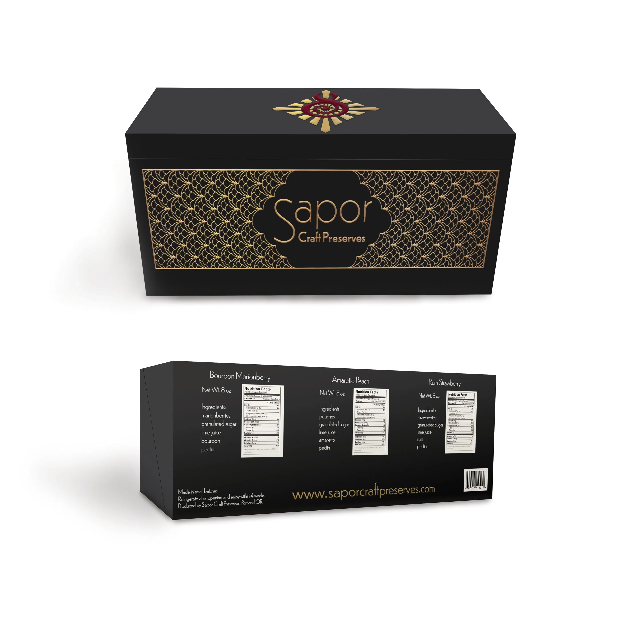
Company Name, Logo and Label
The naming and branding for this new product of craft preserves was designed to stand out amongst other jam options and attract the consumers interested in decadence and quality ingredients. The package design and branding were developed to capture the feel of elegance. By combining the styles and colors of the Art Nouveau and Art Deco eras a sleek modern look was created. A radial pattern was used to reference the rays of the sun ripening the fruit and the patterning of the label was inspired by the marionberry.


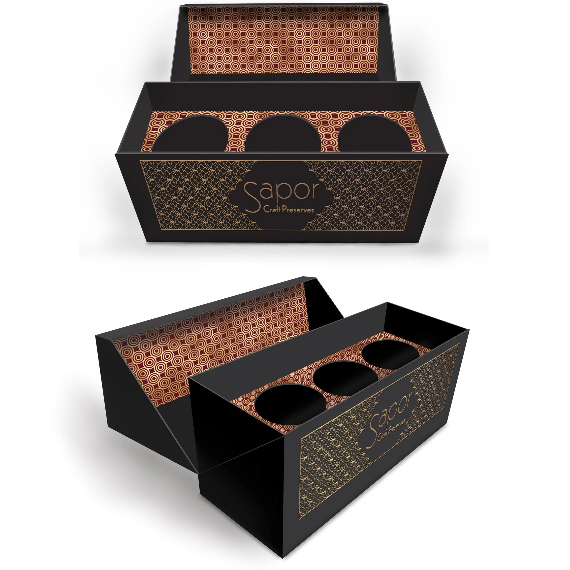
Package Design
Jars: 3.54'' tall x 2.87'' wide,
Box: 4.5'' tall x 3.5'' deep x 9'' wide
The packing needed to include a gift set of preserves that infuses the element of awe and high quality in the experience of the reveal of the product. Incorporating gold foil linings, embossed labels, and a soft-touch finish coating over a well constructed box with a snug fit added to the quality and preciousness of the products to be savored.