Rouser Lifestyle Magazine
Covers & Masthead
Printed & bound:
8.5'' x 11'' pages, 11'' x 17'' spreads
The Rouser masthead uses a minimalist san serif typeface with the ends of the ‘S’ extended to convey unique and unusual qualities that would appeal to the artistic target audience while also being adaptable to working with various styles. Accentuating the rounded aspect of the ‘S’ alludes to the adventurous spirit of many artists and simultaneously creates a self-contained block to draw in the attention of those browsing at the magazine stand.

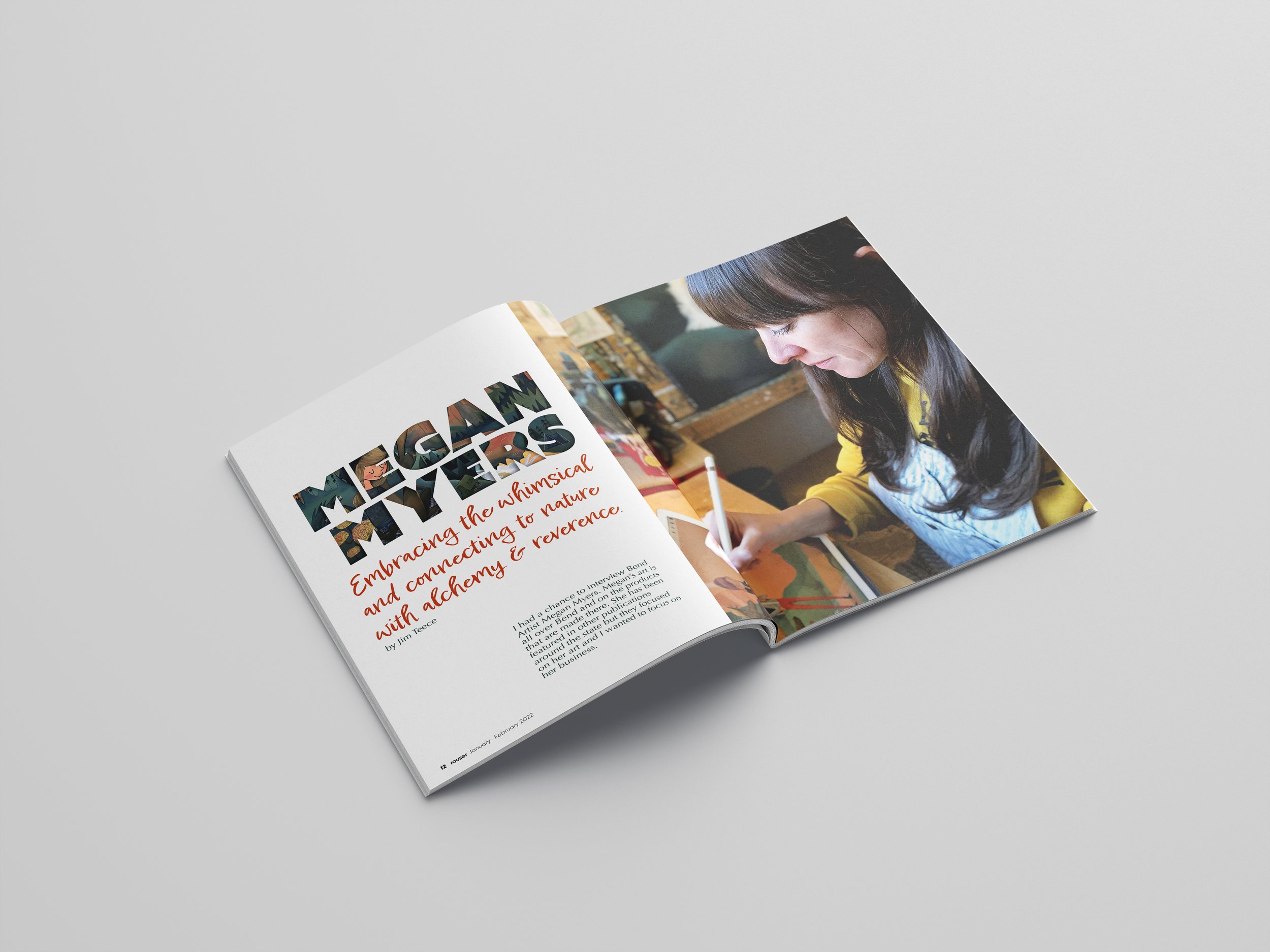
Feature/Title Spread
11”x 17” Layout
The feature spread presented the challenge of developing a title treatment as an introduction to the artist in the article that would connect it to her work. A bold slab face with substanstial space was used as a tool to create a window in which to view a glimpse of the artist’s work. The subtitle typface was chosen to illustrate the whimsical qualities that the artist’s work imbues.

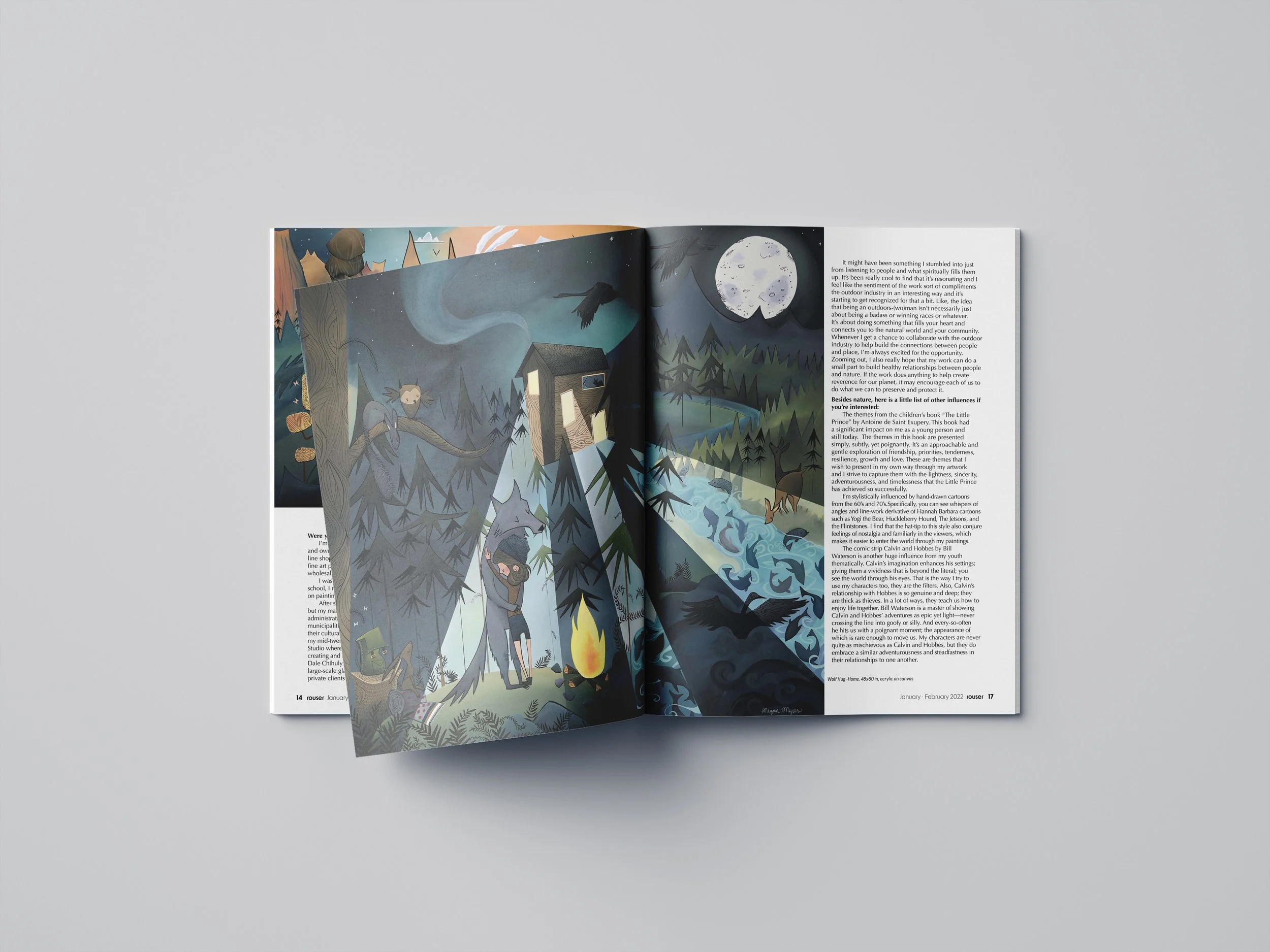
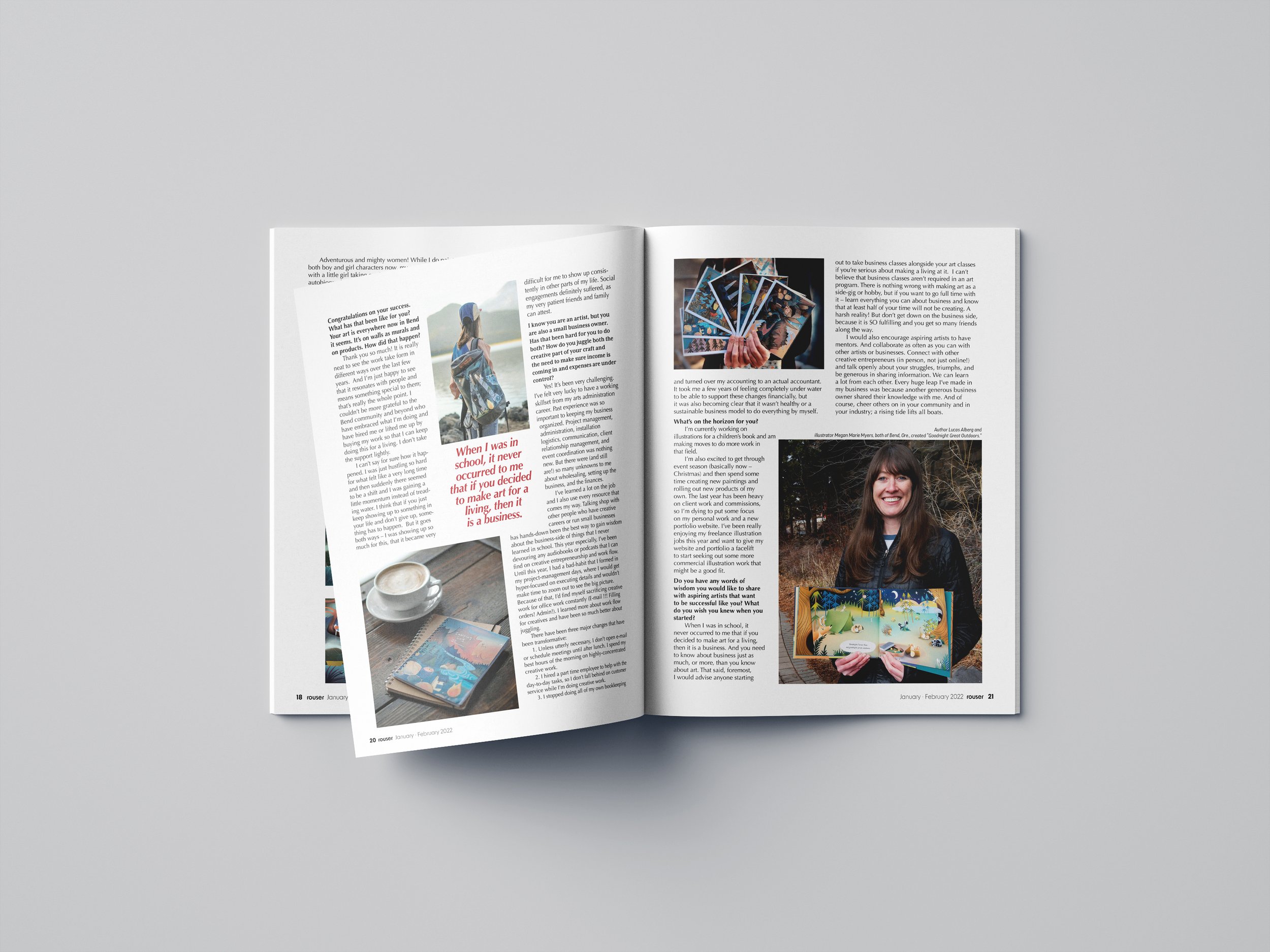
Feature Spreads
11'' x 17'' Layout
The task for laying out the content of the feature article was to select a grid that would provide consistency throughout the article. The images helped to break up the monotony and create variety. They were incorporated in the layout structure like it was a puzzle to be solved. By using a three column layout, the images were balanced with the text to create rhythm as well as provide a steady reading pace.


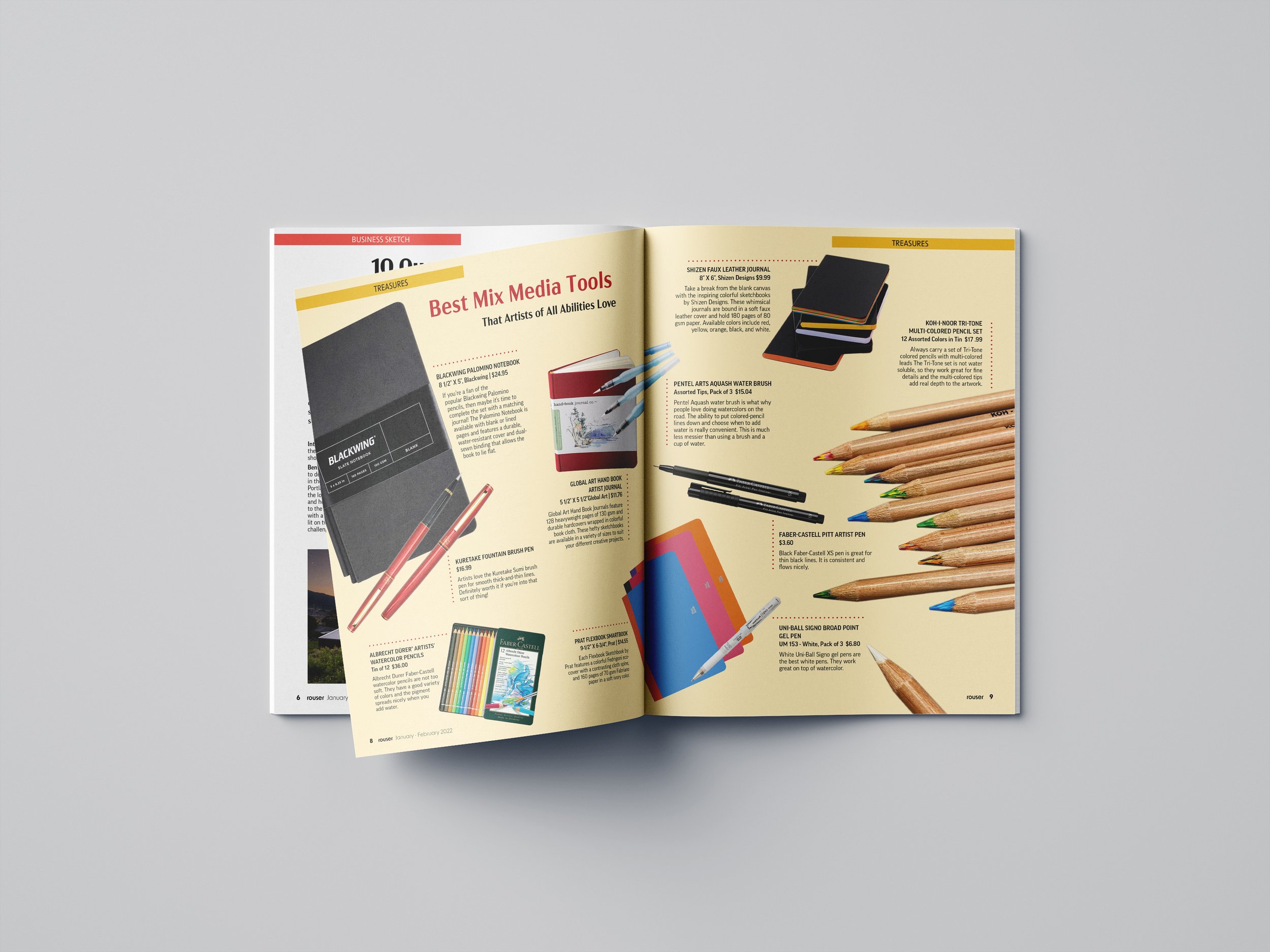
Department Spreads
8.5'' x11'' pages, 11'' x 17'' Layout
The challenge of laying out the department pages and spreads was to select an effective grid system that had the flexibility to work with a variety of content. Multiple columns allowed for combinations that retained consistency through all layouts while also providing freedom to express unique department personalities.


