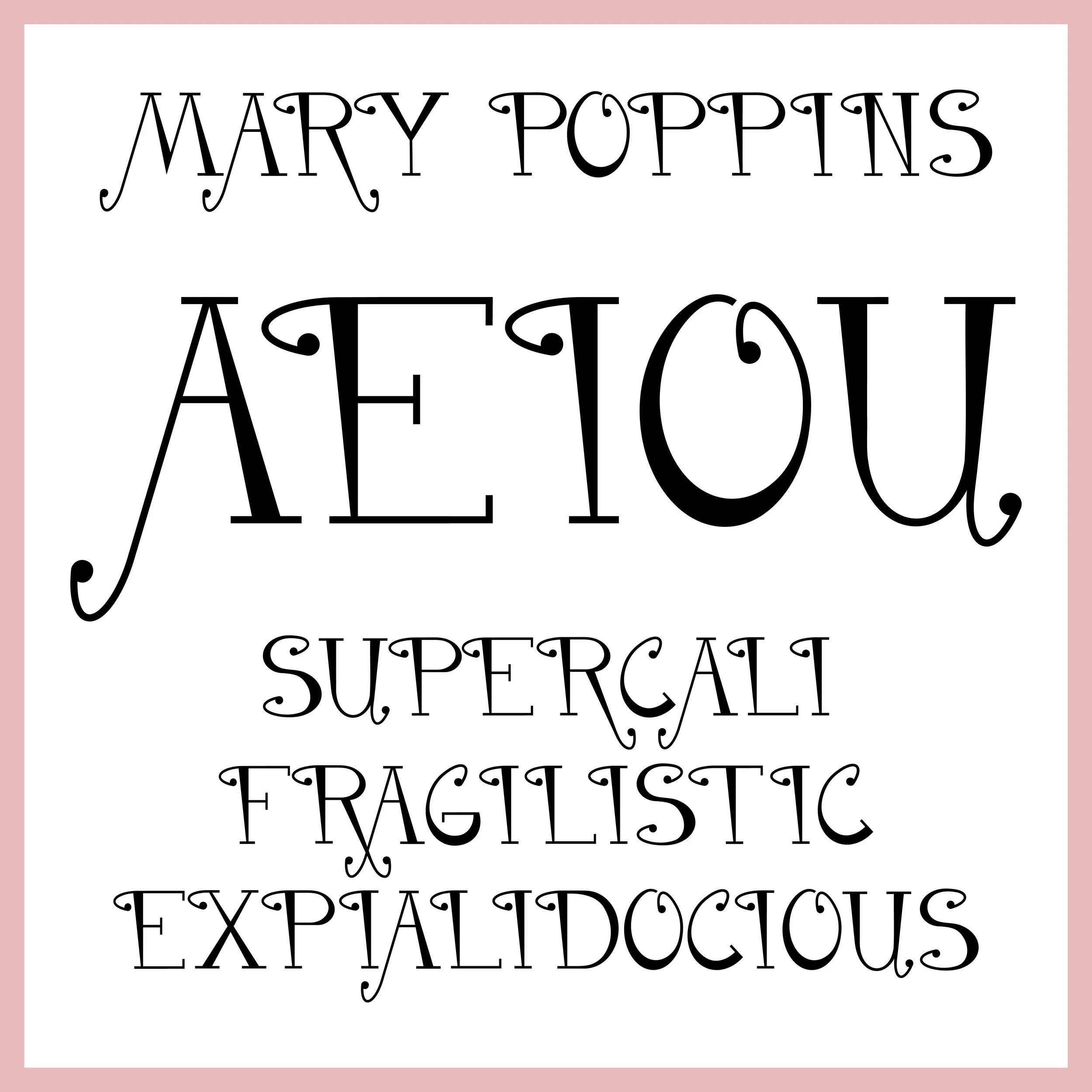
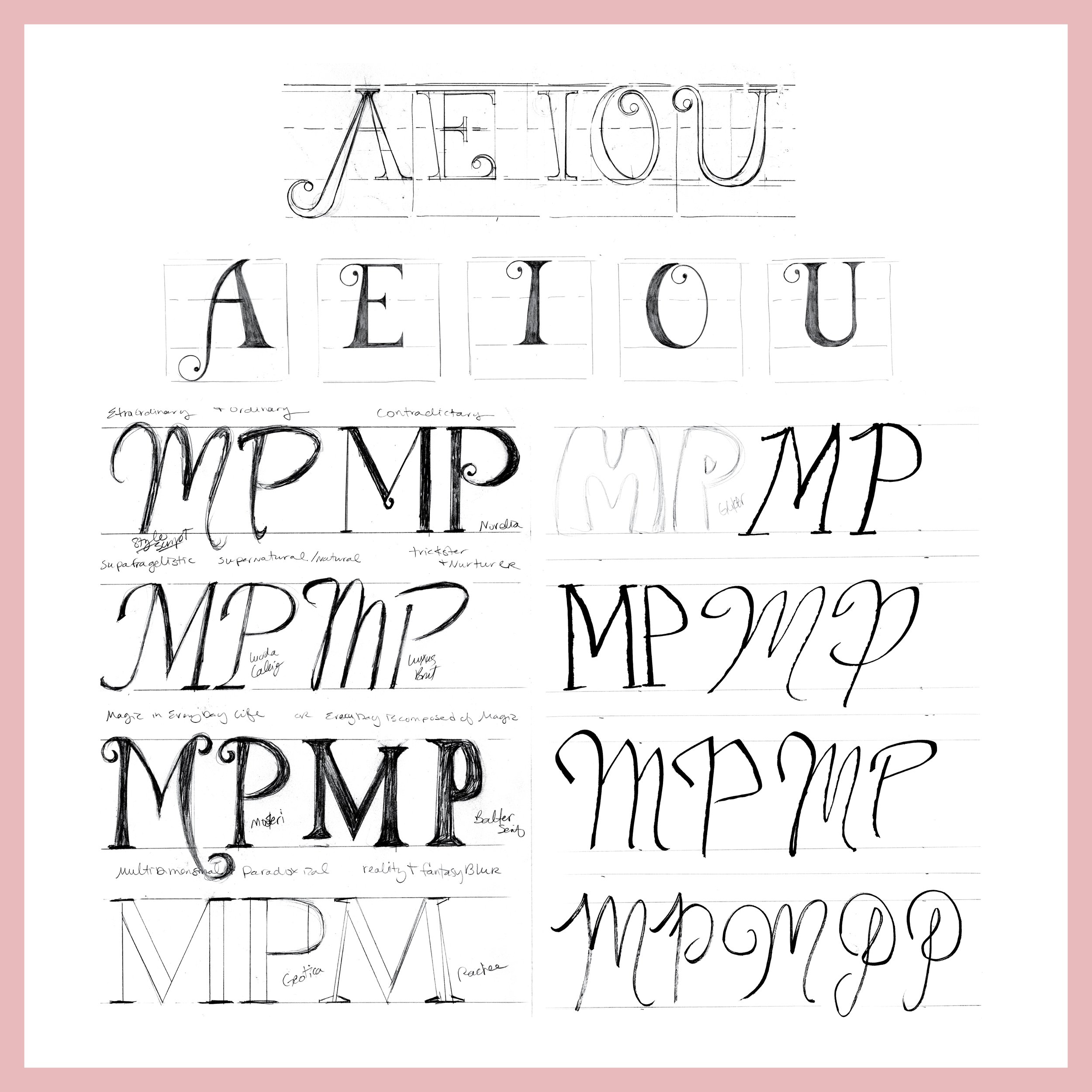
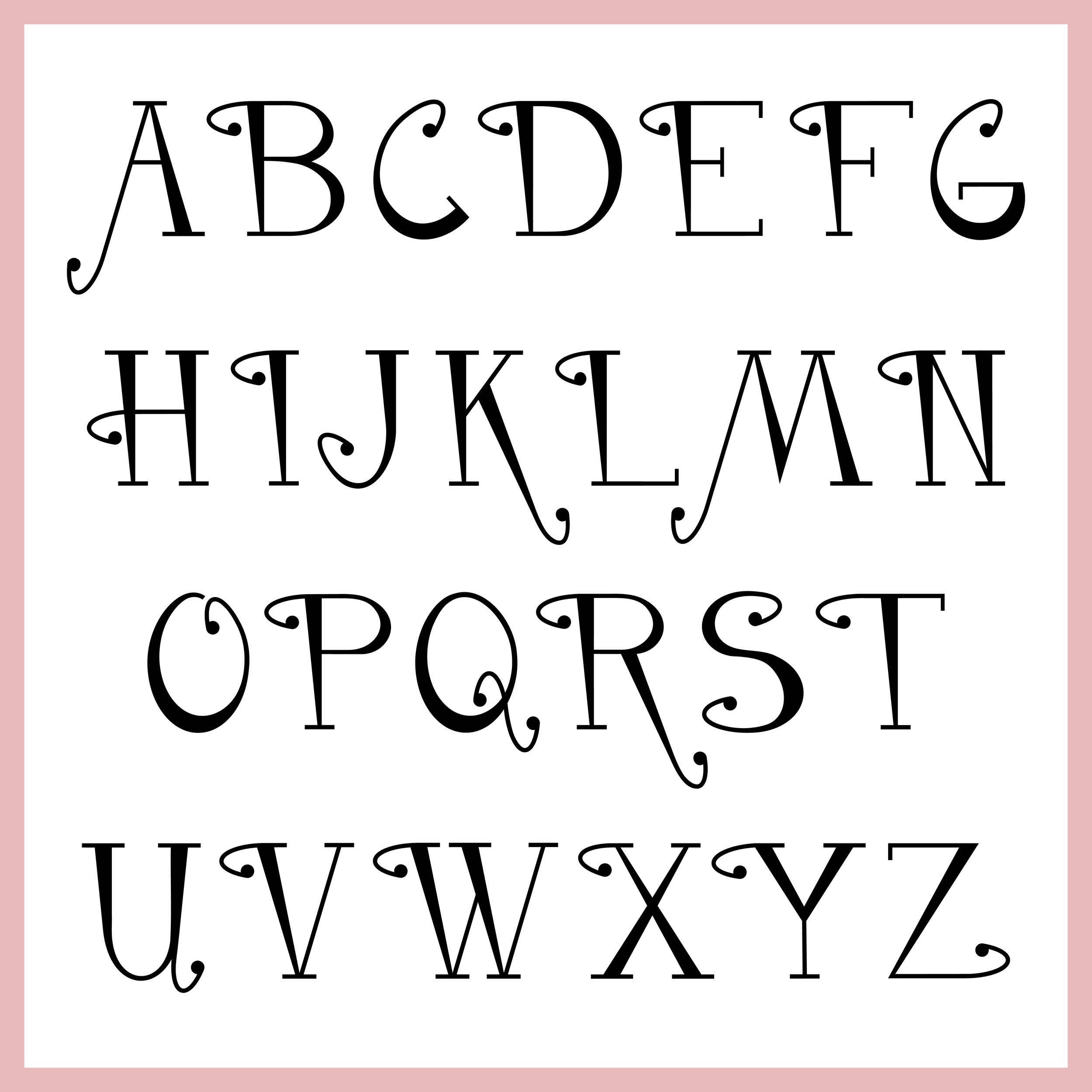
Mary Poppins
Font Design
The goal of this font creation was to illustrate the whimsical yet refined persona of Mary Poppins. By using an upright sophisticated look in the stem with dramatic weight changes, exaggerated curled serifs with ball terminals, a unique and somewhat contradictory quality was created in the typeface that connects to the quirky nature of the fun fictional caregiver.